UX/UI Redesign
Design Systems
UX Research
Education
Β·
9 min read
5 min read

Redesigning UCLA’s Film Archive website to boost event discovery by 80%

Impact

Reduced bounce rate by 90%
for main event finding flow driving deeper user engagement
😍
πŸ’₯
😍
πŸ’₯
😍
πŸ’₯
😍
πŸ’₯
😍
πŸ’₯
😍
πŸ’₯
😍
πŸ’₯
😍
πŸ’₯
Redesigned homepage and event flows
to streamline discovery across devices
🎨
βœ…
🎨
βœ…
🎨
βœ…
🎨
βœ…
🎨
βœ…
🎨
βœ…
🎨
βœ…
🎨
βœ…
Built a scalable design system
with 16 reusable components, increasing design consistency and development
❀️
πŸ§‘πŸ½β€πŸ’»
❀️
πŸ§‘πŸ½β€πŸ’»
❀️
πŸ§‘πŸ½β€πŸ’»
❀️
πŸ§‘πŸ½β€πŸ’»
❀️
πŸ§‘πŸ½β€πŸ’»
❀️
πŸ§‘πŸ½β€πŸ’»
❀️
πŸ§‘πŸ½β€πŸ’»
❀️
πŸ§‘πŸ½β€πŸ’»

Client

UCLA's Film & Television Archive

Role

UX/UI Designer
Visual Designer

Team

Serena Tie (Visual Designer)
Taylor Che (UX Designer)

Timeline

5 months (part-time)

Tools & Skills
  • Design: Wireframing, Rapid Prototyping, Design Systems
  • Research: Usability Testing, A/B Testing
  • Stakeholder Management: Data Driven Advocacy, Design Documentation
Problems
Discovering archive content was unnecessarily difficult
Film enthusiasts struggled to browse UCLA’s Film & Television Archive due to disorganized information architecture and a poor mobile experience, limiting content discovery and engagement.
Discovering archive content was unnecessarily difficult
Problem
This is a where the content's paragraph copy will go. It should only be 4 lines max.
Solution / my role
This is a where the content's paragraph copy will go. It should only be 4 lines max.
Impact
This is a where the content's paragraph copy will go. It should only be 4 lines max.

Hover a problem to explore the details.

User problem 01

No ticketing entry points

User problem 02

Unusable for senior citizens

Biz problem 03

Collections page ignored

Biz + user problem 04

Design stuck in the 2000s

???No CTA

No ticket CTA visible on the homepage

User problem 01

No ticketing entry points

The primary reason visitors come is to find screenings and buy tickets. Yet there is not a single prominent CTA on the homepage β€” forcing users to hunt through menus.

Impact

0

ticket CTAs above the fold

7,984

clicks hunting for events

CALENDARSMTWTFS67813Targetdate 6Wrongtap!

Dense calendar β€” tiny tap targets on mobile

User problem 02

Unusable for senior citizens on mobile

The archive’s core audience skews older. The calendar has tiny tap targets and no mobile view β€” making it nearly impossible for senior users to browse upcoming events on their phones.

Key insight

65+

avg age of core audience

WCAG

accessibility standards not met

Events page
7,984
7,984
Collections
225

35Γ— more clicks on Events than Collections

Business problem 03

Collections page is practically invisible

The archive holds thousands of rare films β€” its most unique asset. The Explore Collections page gets only 225 clicks, dwarfed 35Γ— by the Events page, because nothing surfaces it prominently.

The gap

35Γ—

more clicks on events

225

collections page clicks

Dark layout unchanged since the early 2000s

Business + user problem 04

Web design stuck in the early 2000s

The archive’s visual design is outdated and fails to reflect the prestige of the institution. Users described the site as untrustworthy. Every stakeholder and user interviewed called for a full visual overhaul.

From research

100%

requested a redesign

0

shared design components

Solution
Redesign the Film and Television Archive's website
I came up with three goals to make sure the website redesign would be successful, based on user and stakeholder interviews.
Redesign the Film and Television Archive's website
Problem
This is a where the content's paragraph copy will go. It should only be 4 lines max.
Solution / my role
This is a where the content's paragraph copy will go. It should only be 4 lines max.
Impact
This is a where the content's paragraph copy will go. It should only be 4 lines max.
Project goals

Hover a goal to explore its details.

Modernizethe ArchiveExperience01Updatevisuals02MobileUX03Discoverevents
BeforeAfter
01
Update visuals

Modernize and simplify design components across the entire site to reflect contemporary archival standards and user expectations.

Target outcome

β†— Increase trust and clarity

Key actions

β€” Refresh typography and color systemβ€” Redesign navigation and layoutβ€” Build a cohesive component library
QuickEasy
02
Improve mobile UX

Make access to archive resources quick and easy on the go β€” anywhere, on any device, at any bandwidth.

Target outcome

β†— Reduce friction and increase engagement

Key actions

β€” Mobile-first responsive layoutβ€” Optimized search and filteringβ€” Faster media asset load times
APRIL 2025
03
Discover events

Highlight upcoming screenings, exhibitions, and programs to satisfy the needs of primary user groups.

Target outcome

β†— Increase event discovery and attendance

Key actions

β€” Events calendar prominently on homepageβ€” Calendar and email remindersβ€” Personalized event recommendations
Film and Television Archive
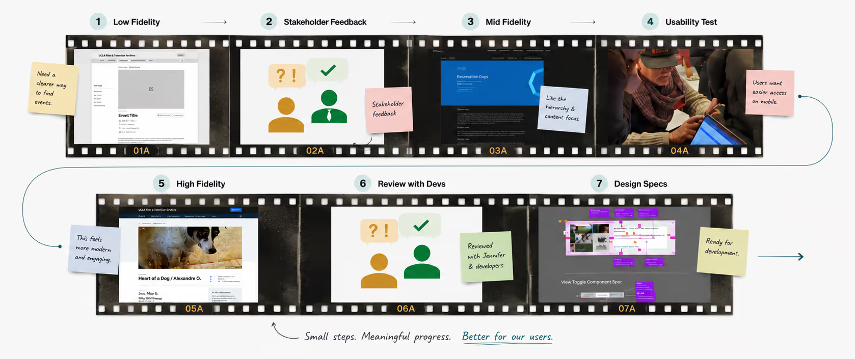
Design Process
Iterate, Feedback, Repeat
After gathering insights from user and stakeholder interviews, the team decided the archive's website needed a UI refresh. We iterated based on these findings, regularly consulting with our primary stakeholder, Jennifer Rhee, Digital Content Manager of UCLA's Film and Television Archive.
Iterate, Feedback, Repeat
Problem
This is a where the content's paragraph copy will go. It should only be 4 lines max.
Solution / my role
This is a where the content's paragraph copy will go. It should only be 4 lines max.
Impact
This is a where the content's paragraph copy will go. It should only be 4 lines max.
Design Process
"Wait! What About Usability?"
After creating various mockups, I noticed we were prioritizing visuals over usability. We debated details like sharp or rounded corners for components instead of asking, "Is this specific component helping users find film screenings? Is it easy to use?"

To address this, I suggested in-person usability testing with our end users. Our UX team tested our desktop and mobile prototypes, measuring task completion success rates and A/B testing filtering components.
"Wait! What About Usability?"
Problem
This is a where the content's paragraph copy will go. It should only be 4 lines max.
Solution / my role
This is a where the content's paragraph copy will go. It should only be 4 lines max.
Impact
This is a where the content's paragraph copy will go. It should only be 4 lines max.
USABILITY TESTING INSIGHT 1
A/B test: filtering bottom sheets performed best
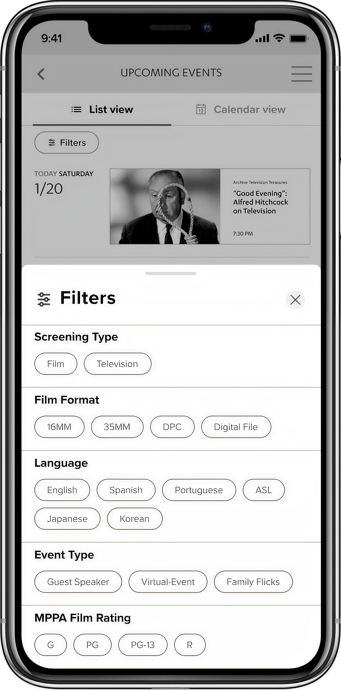
Our team was uncertain whether a bottom sheet or horizontal scrolling would be better for filtering events on the detail page. We tested both designs with participants, asking them to apply three filters: 36mm, 16mm, and Guest Speaker. We measured completion rates and gathered qualitative feedback to improve the component.
A/B test: filtering bottom sheets performed best
Problem
This is a where the content's paragraph copy will go. It should only be 4 lines max.
Solution / my role
This is a where the content's paragraph copy will go. It should only be 4 lines max.
Impact
This is a where the content's paragraph copy will go. It should only be 4 lines max.
Replay animation
Variant A β€” horizontal scrollA
0%task success rate

Users struggled to find filters hidden off-screen with no scroll affordance.

Why it failed
Most filters hidden off-screen β€” users didn’t know more existed
Horizontal scroll conflicted with page-level swipe gestures
No way to know the total number of available filters
Variant B β€” bottom sheetB
0%task success rate

All filter options visible at once β€” users could scan and select with confidence.

Why it won
All options visible in one scrollable sheet β€” nothing hidden
Grouped sections made it easy to scan by category
β€œDone” button gave users a clear confirmation moment
USABILITY TESTING INSIGHT 2
Confusing Language
Users were confused by terms such as β€œVirtual Events” and β€œTouring Series.” From this insight, I collaborated with the Director of Content to rewrite confusing filtering tags, choosing wording that would be easily understood by our Gen X users.
Confusing Language
Problem
This is a where the content's paragraph copy will go. It should only be 4 lines max.
Solution / my role
This is a where the content's paragraph copy will go. It should only be 4 lines max.
Impact
This is a where the content's paragraph copy will go. It should only be 4 lines max.
Before
Filtering Bottom Sheet - V1
1
2
3
1
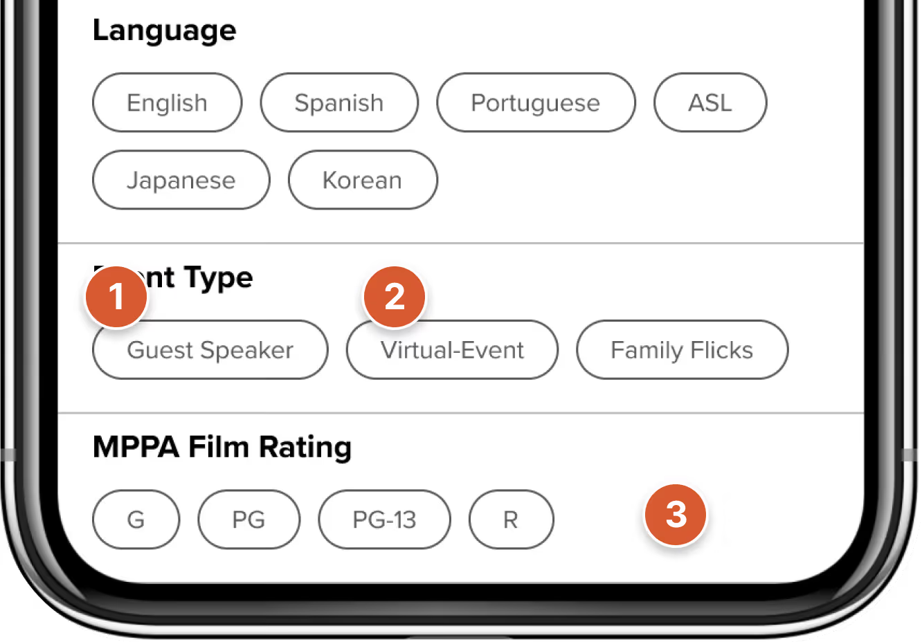
Small Touch Targets + Lack of Icons
Difficult for users to tap + understand what the buttons were
2
Content Design Confused Test Participants
Unusual terms like "Virtual-Event" are hard to understand
3
Next Step Confusion
Users were unsure what to do after selecting their filters
after
Filtering Bottom Sheet - Final
1
2
3
1
Increased Size + Added Icons
Lowers cog load when scanning
2
Simplifying Content Design
Changed β€˜Virtual-Event’ to β€˜Online Screening’ to reduce cog. load
3
Added of 'Done' button
Affordance gives users guidance on next step
USABILITY TESTING INSIGHT 3
Ticketing Information Location is Confusing
To help users find ticketing information, I proposed a collapsible sheet fixed at the bottom of the screen. My hypothesis was that users could toggle the bottom sheet at any point while scrolling the event detail page to view ticketing info.
Ticketing Information Location is Confusing
Problem
This is a where the content's paragraph copy will go. It should only be 4 lines max.
Solution / my role
This is a where the content's paragraph copy will go. It should only be 4 lines max.
Impact
This is a where the content's paragraph copy will go. It should only be 4 lines max.
Before
Pattern 1 - Toggle Component
1
2
3
1
90% Of Participants Could Not Locate Component
"Was this there the whole time!?" - User quote
2
Allows for consistent access
Users primary goal was finding ticketing information, this would allow them to find it easily.
after
Final Pattern - Ticket Info Block
1
2
3
1
Matches Users Mental Model
Users preferred to have ticketing information at the top of the page.
2
Parity with Desktop Version
Improves consistancy and reduces engineering effort.
RESOLVED PROCESS
Component Standardization
As we neared completion of our designs, and prepared to hand off designs to engineering I raised concerns about inconsistencies among designers' work.

Between the visual designer and myself there were differences in spacing, text token usage, image aspect ratio and so on. To lower the level of engineering effort and to create a unified design across the entire website, I audited and created standardized components for our most used UI components, ensuring a cohesive user experience.
Component Standardization
Problem
This is a where the content's paragraph copy will go. It should only be 4 lines max.
Solution / my role
This is a where the content's paragraph copy will go. It should only be 4 lines max.
Impact
This is a where the content's paragraph copy will go. It should only be 4 lines max.
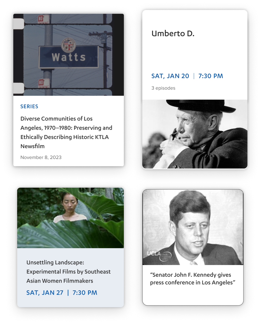
Before - Inconsistent Cards
Tag size9px / 10px / 11px / none
Title size11px / 12px / 15px / 16px
Padding4px / 8px / 12px / 14px
Image ratio4:3 / 16:9 / none
BG colorBlue / White
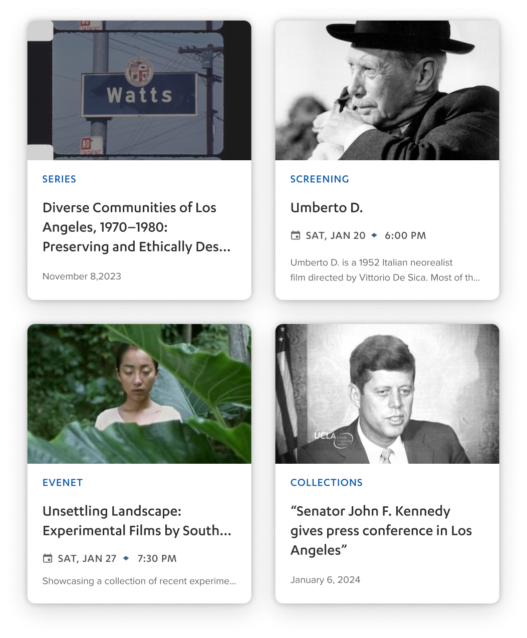
After β€” standardized cards
Tag size20px always
Title size24px always
Padding16px always
Image ratio16:9 always
BG color1 Primay-BG token always
High Fidelity
Final Designs
As the final stage of the project, I collaborated closely with the Head of Content Design, key stakeholders, and developers to establish a visual language that reflected the archive’s educational mission.
Final Designs
Problem
This is a where the content's paragraph copy will go. It should only be 4 lines max.
Solution / my role
This is a where the content's paragraph copy will go. It should only be 4 lines max.
Impact
This is a where the content's paragraph copy will go. It should only be 4 lines max.

Home Page

Event Detail Page

View Location Bottom Sheet

Event Listing Page

Event Filtering Bottom Sheet

Event Calendar Bottom Sheet

Before
Mobile Homepage
1
2
3
X
90% Of Participants Could Not Locate Component
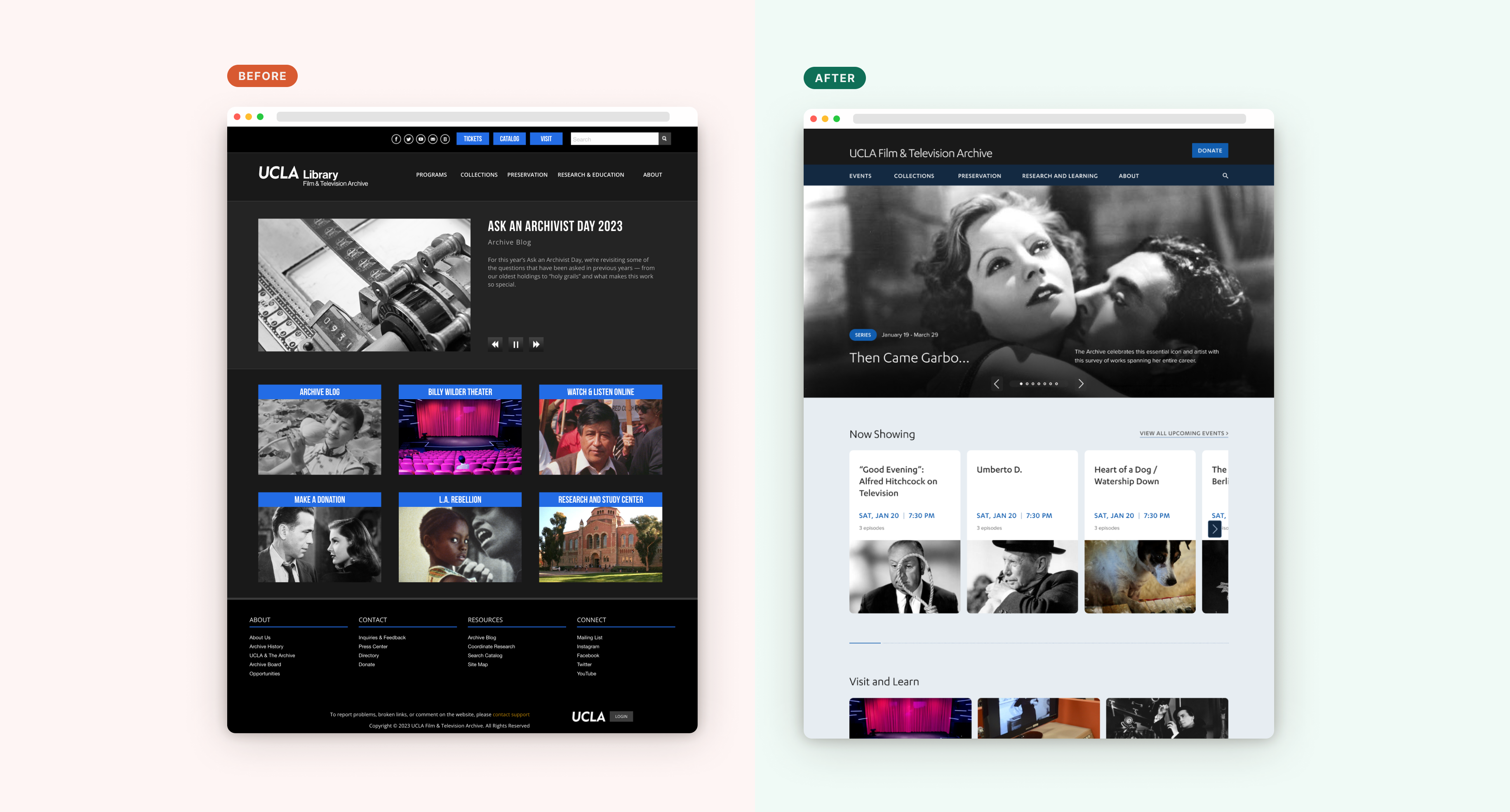
No links for upcoming events or archive collections, and small blue link blocks are easily missed or accidentally tapped.
X
Allows for consistent access
Users primary goal was finding ticketing information, this would allow them to find it easily.
after
Mobile Homepage
1
2
3
βœ”οΈŽ
Matches Users Mental Model
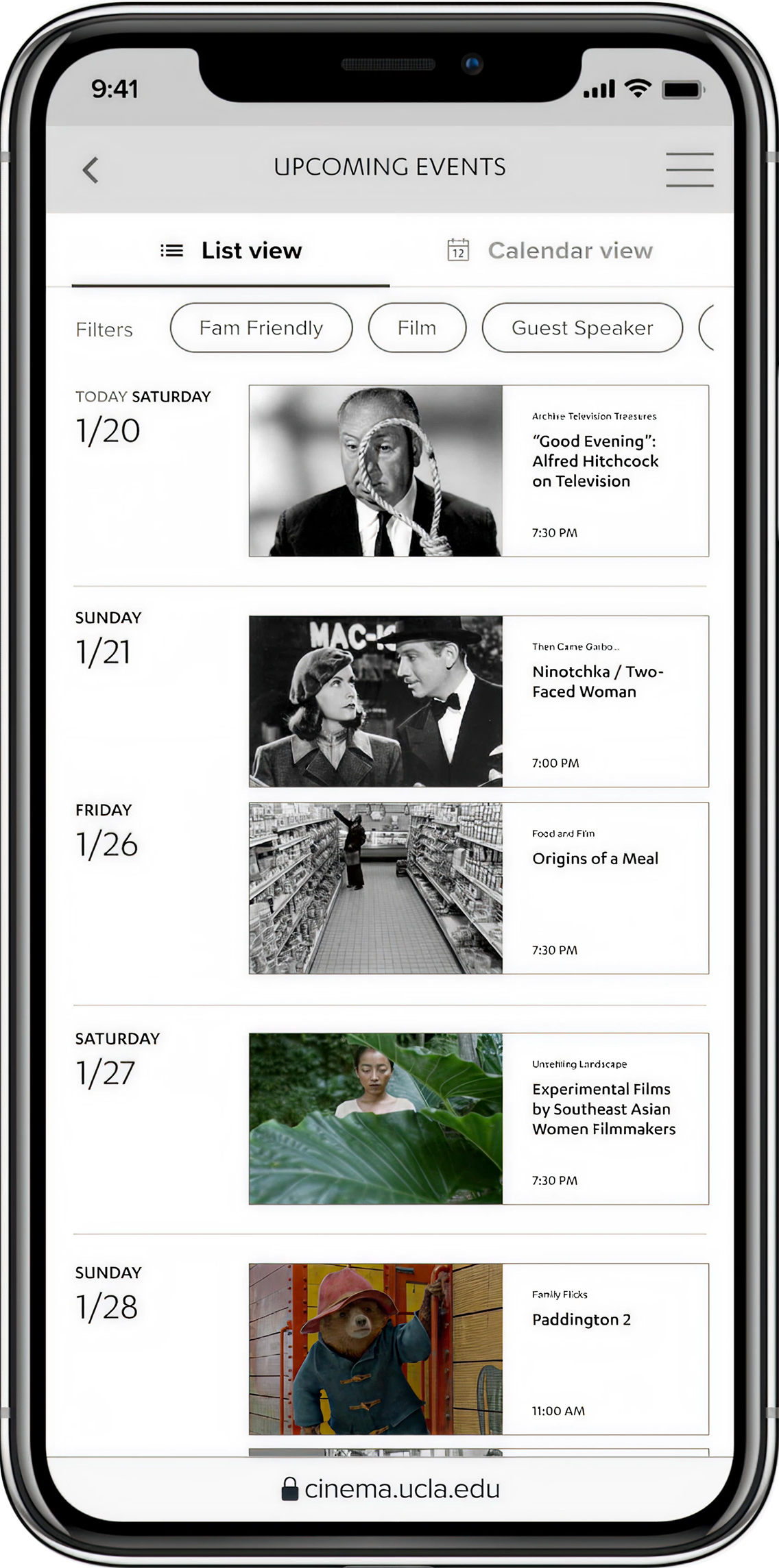
Added a homepage carousel for events and archives, and improved link visibility with larger containers.
βœ”οΈŽ
Parity with Desktop Version
Improves consistancy and reduces engineering effort.
Before
Desktop Homepage
1
2
3
X
90% Of Participants Could Not Locate Component
Vague link labels like 'Watch & Listen Online' and 'LA Rebellion' confused users about the link destinations.
X
Allows for consistent access
Users primary goal was finding ticketing information, this would allow them to find it easily.
after
Desktop Homepage
1
2
3
βœ”οΈŽ
Matches Users Mental Model
The redesigned homepage highlights the archive's offerings film screenings, blogs, and restoration info using insights from stakeholder and user interviews.
βœ”οΈŽ
Parity with Desktop Version
Improves consistancy and reduces engineering effort.
Impact
Reducing Friction and Improving Accessibility
With the improvements we were able to improve accessibility and usuability metrics for our primary user group.
Reducing Friction and Improving Accessibility
Problem
This is a where the content's paragraph copy will go. It should only be 4 lines max.
Solution / my role
This is a where the content's paragraph copy will go. It should only be 4 lines max.
Impact
This is a where the content's paragraph copy will go. It should only be 4 lines max.
90% β†’ 10%
Bounce rate reduction for ticket finding task
βˆ’80 pts
Improved
Accessibility for users aged 65+ on mobile devices
WCAG compliant
1 system
Unified design system for dev hand-off
Shipped

Reflections

What I learned building this

Working on the UCLA Film & Television Archive redesign pushed me outside my comfort zone in ways that shaped how I approach every project since.

01

This is a Library, NOT Tinder!

I defaulted to consumer aesthetics that clashed with the archive's academic identity. Feedback taught me to match design tone to institutional context β€” not just to what looks current.

02

Prioritize Structure Over Visuals

Jumping to design system details too early pulled stakeholder conversations toward color instead of content. Low-fidelity wireframes first completely recentered the feedback I was getting.

03

Iterate, Iterate, Iterate!

Real product design rewards iteration in a way studio coursework doesn't prepare you for. Each cycle tightened the design and built my ability to defend decisions with evidence rather than instinct.

Get in touch

Ready to design something that actually works?

I bring research rigor, systems thinking, and a bias for simplicity. Whether it’s a 0β†’1 product or a redesign that needs to ship β€” I’m ready to contribute from day one.

User research & usability testing
Information architecture & wireframing
Design systems & component standardization
Cross-functional collaboration
Contents